More Than a Logo: A Decade of Dreams from NYC to Nairobi
From a 2015 Sketch in NYC to a Global Legacy with Hibiscus Creative
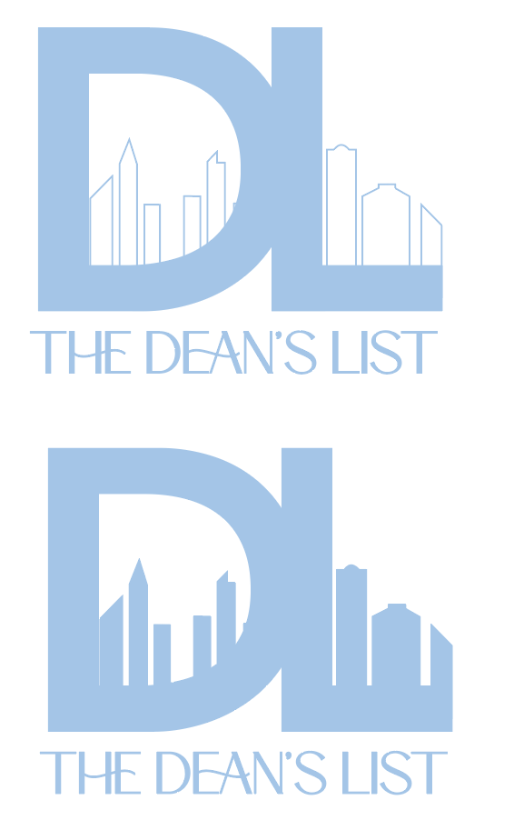
2015 Logo
Ten years ago, The Dean’s List was just a spark of an idea. In 2015, a sweet intern named Dana in NYC sat down and created our first-ever visual identity. It was a simple, light blue outline of the New York City skyline—a perfect reflection of where I was at the time: living in a tiny room in Hell’s Kitchen, working my 9-5 at CBS Inside Edition, and pouring my heart into my 5-9.
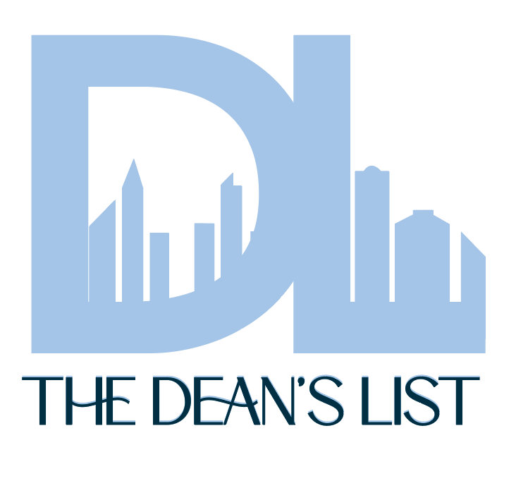
But as the company grew, our mission expanded far beyond the borders of Manhattan. To celebrate our evolution, I collaborated with the brilliant Anna at Hibiscus Creative (a Dean’s List Mobile Magic cohort member and friend) here in Charlotte to create a logo that doesn't just look professional—it tells the story of every city and every woman who helped build this brand.
The "D" for Domestic: My American Roots & Map of My Life
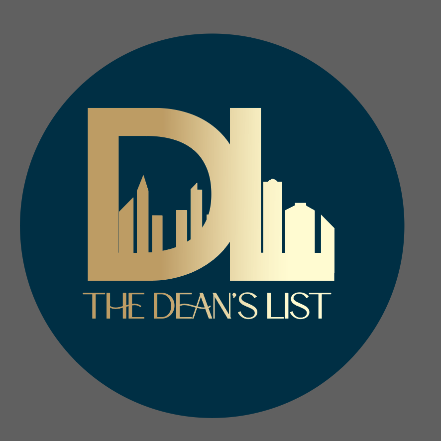
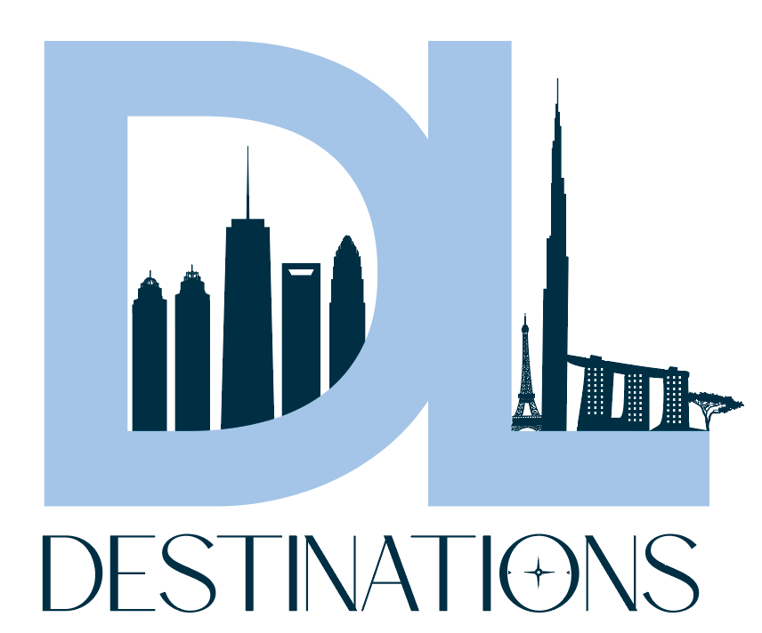
The letter "D" in our new logo represents the national journey of The Dean’s List. Every building nestled inside the curve of the "D" is a milestone:
The King and Queen Buildings (Atlanta): These represent my hometown and my foundation. This is where my Dad (who also went full-time with his company at 30) helped me incorporate the business, and where my journalism roots began at Fox 5 Atlanta.
The Queen Building Connection: I did my very first interview in the Queen building, a moment that set my career in motion.
Mentorship at CNN HQ: These silhouettes also honor my time at CNN HQ in Atlanta, where I met one of my primary mentors, Sonia Tucker.
One World Trade Center (New York City): A nod to the NYC chapter where I moved after the University of Georgia. This represents the "hustle" era—starting The Dean's List in the evenings after my shifts at CBS (from my 9-5 to 5-9).
The Charlotte Skyline: Finally, the skyline of Charlotte marks where we have truly flourished. It is where our HQ stands today and where we continue to grow our community.
The "L" for Legacy: International Impact
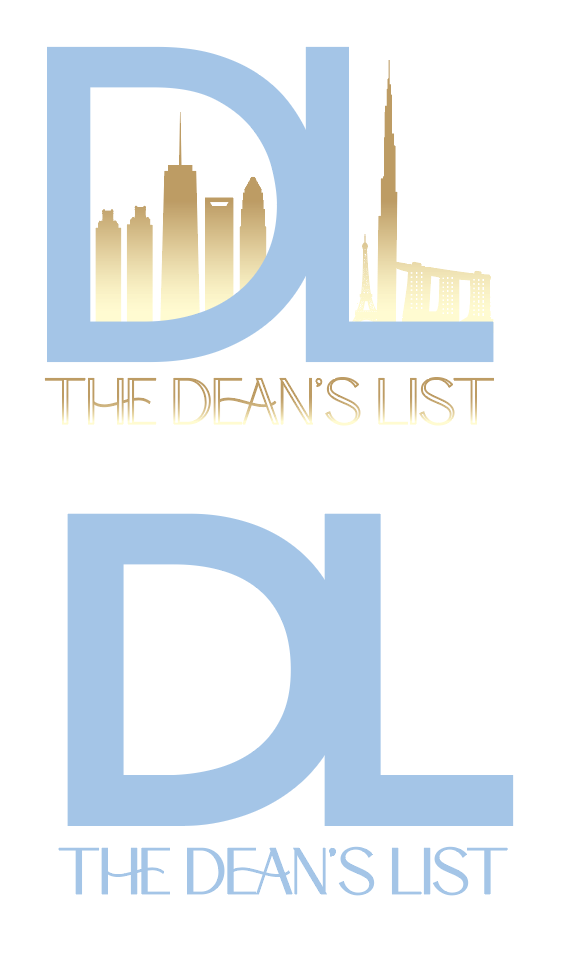
The "L" represents our global reach and the deeper "Why" behind our work. While the "D" is about where I've been, the "L" is about the lives we touch around the world:
The Acacia Tree (Nairobi, Kenya): This is the heart of the logo. It represents my family’s nonprofit and the core reason I started The Dean’s List: to help Habitat Aid financially in their capacity building projects with girls' schools, wells, and clinics in Western Kenya. It’s about supporting women internationally.
The Eiffel Tower (Paris & Tours, France): This represents my first exchange in high school and my first internship at age 17 at Terre des Langues. These early bonds taught me the importance of international relationships, which eventually led to our current Dean’s List destination trips.
Marina Bay Sands (Singapore): This silhouette marks the start of our first-ever Dean’s List Destination trip. I started the trip with 2 of the travelers in Singapore before meeting the rest of our group a week later in Bali, Indonesia. That trip changed my life and everyone else’s who joined; it was the moment I realized I could travel for work while helping others realize their true potential through life-changing experiences.
The Burj Khalifa (Dubai): This represents my first intentional solo trip to Dubai. It was an empowering moment as a woman to discover I could find connections and thrive anywhere in the world—a message of independence I want every woman in our community to feel.
A Masterclass in Design: Working with Hibiscus Creative
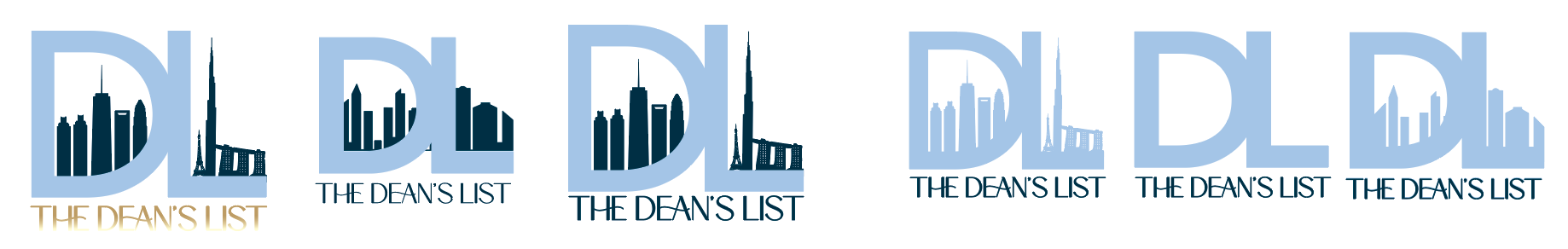
I cannot thank Anna from Hibiscus Creative enough for her patience and vision. We went through several iterations to get the balance just right:
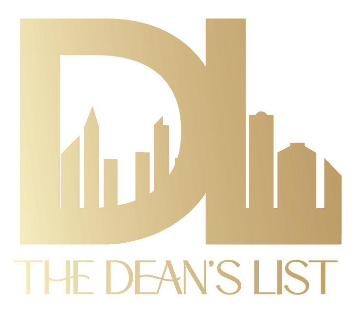
Iteration & Contrast: We experimented with different weights, eventually choosing the high-contrast navy and light blue. This ensures the intricate landmarks—like the Eiffel Tower and the upcoming Acacia tree—remain clear and powerful.
Meaningful Choices: Anna understood that this wasn't just about "buildings"; it was about honoring the 2015 legacy while elevating it into a sophisticated, modern brand.
Font: Eternal spring for hope for the future and elegance and grace.
Colors: Our iconic Dean’s List light blue with a luxe navy.
Every step, every city, and every choice makes a difference in an entrepreneur’s journey. This logo is proof that you can start in a tiny room in Hell’s Kitchen and end up impacting lives from Charlotte to Kenya. Online presence to offline impact.